Information provided is based on research. We strive for accuracy, but consult professionals for personalized advice. External links are not under our control. See our Privacy Policy for details.
As a designer, you’ll likely come across two primary structuring tools in Figma: Frames and Groups. While both are helpful, they serve different purposes.
Knowing when to use each can significantly enhance your design flow and organization.
Through my experience with Figma, I’ve realized the impact of selecting the right structure, especially when managing complex projects or collaborating with other designers.
This guide will take you through the specific situations where each tool shines, offering a hands-on approach to deciding between Frames and Groups.
Let’s start by understanding what Frames and Groups are and then dive into scenarios that clearly outline when each should be used.
Related: Can Figma Export to HTML?
What Are Frames in Figma?
Frames in Figma are more than simple containers. They have structural properties similar to artboards, allowing them to act as canvases within canvases.
Frames come with additional controls, such as layout grids, constraints, and overflow behavior.
These features are key when creating responsive designs or components.
What Are Groups in Figma?
Groups in Figma are basic organizational tools used for bundling multiple objects together.
A Group does not have the same structural properties as a Frame, but it’s useful when you want to move, scale, or apply actions to several objects at once without altering their relative positions.
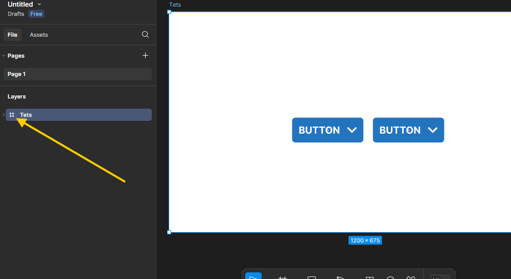
I identify a Group by the “hashtag” symbol (#) before the layer name. See the image below for clarification.
Key Differences Between Frames and Groups
To make an informed choice, it’s crucial to understand the core differences between Frames and Groups:
- Frames allow for responsive layouts, constraints, and scrolling options.
- Groups are ideal for simpler organization without additional structure.
- Frames have layout grids and can hold multiple nested elements.
- Groups keep elements together without altering their individual properties.
Now that we’ve laid the foundation, let’s dive into specific situations and best practices to guide your choice.
Related: Are Figma Resumes ATS Friendly? Here’s What You Need to Know
When to Use Frames in Figma
1. Responsive Design Layouts
Frames are essential for responsive design. You can set constraints within a Frame, allowing elements to adapt based on the screen size or container dimensions.
This is particularly helpful for web and app design, where responsive layouts are critical. By using Frames, you can set rules like “stick to the left” or “scale with the container,” ensuring consistency across screen sizes.
Example:
Imagine you’re designing a navigation bar. Using a Frame, you can anchor elements to either side, keeping the layout intact regardless of the screen width.
This flexibility is invaluable for creating consistent, adaptable designs.
2. Scrollable Areas
Frames allow you to define scrollable areas, which can enhance your prototype’s realism. Scroll functionality within Frames simulates the actual user experience, making it a valuable tool for user testing.
Example:
For a mobile app, you might have a content feed that needs to scroll.
Using a Frame with vertical scrolling enabled, you can simulate the experience seamlessly, giving stakeholders a more accurate preview of the final product.
3. Layout Grids for Precise Alignment
Frames provide layout grids that help maintain alignment and consistency in your designs. This feature is helpful when designing for structured layouts, like data tables, photo galleries, or any interface requiring grid-based alignment.
Example:
Consider an e-commerce app where products are displayed in a grid. By setting up a layout grid within a Frame, you ensure that each product aligns correctly, creating a visually pleasing, orderly interface.
4. Component and Symbol Creation
Frames are used when building components in Figma, as they can contain nested elements with consistent behaviors. When you create a component from a Frame, you can use instances of it across your design while keeping changes centralized.
Example:
Imagine creating a button component. By using a Frame, you can define the button’s responsive behavior and add layers, like icons and text, inside the Frame. This approach keeps everything organized and lets you update button styles consistently across the design.
5. Design Constraints for Flexible Layouts
Frames allow you to set constraints on child elements, making them ideal for designs that need flexibility. Constraints give you control over how elements resize, making Frames indispensable for creating adaptable UIs.
Example:
A sidebar navigation can be designed within a Frame to adapt when the main content area resizes. By setting constraints, the sidebar can stay anchored to the left, ensuring a responsive layout.
6. Managing Overflow Behavior
Frames let you manage overflow, such as hidden or scrollable content, which can simulate real-world behaviors. You can choose to clip overflow or make it scrollable, adding a level of interactivity to your designs.
Example:
If you’re creating a dashboard with more data than can fit on a screen, you can set the Frame to scroll vertically, allowing users to scroll through the data. This functionality adds a realistic element to your prototype.
When to Use Groups in Figma
1. Simple Organization of Elements
Groups are perfect for basic organization without any constraints or layout properties. They’re great when you need to keep elements together temporarily or don’t require advanced layout control.
Example:
If you’re arranging a set of icons for a presentation slide, a Group will hold them together, letting you move them easily without affecting their individual properties.
2. Aligning Non-Responsive Elements
Groups work well when you don’t need responsive behavior. For static layouts where elements remain fixed, a Group can help maintain their positions without the need for constraints.
Example:
Consider a set of social media icons that will always be positioned in a fixed row. Grouping these icons ensures they stay together when moved but doesn’t add unnecessary responsive behavior.
3. Quick Layer Management
Groups are useful when you want to organize your layers for quicker navigation without adding structural complexity. This can make it easier to locate elements in complex designs without changing their layout behavior.
Example:
If you have multiple text layers that represent instructions on a form, you can group them to streamline your layer structure, making it easier to find them when you need to make edits.
4. Temporary Grouping for Easy Manipulation
Groups are helpful when you need to apply temporary changes to a set of elements, like resizing or moving, without altering individual properties.
Example:
If you’re adjusting a set of buttons for alignment testing, grouping them lets you move them as a unit. Once you’ve finalized the placement, you can ungroup them if you need individual control again.
5. Basic Prototyping Needs
For simpler prototypes without scrollable content or layout constraints, Groups can keep elements organized without the need for Frames. This approach is more straightforward and requires less setup.
Example:
A static landing page design can use Groups for different sections (like header, footer, etc.) to keep elements together without adding extra structure.
FAQs
1. What’s the main difference between Frames and Groups in Figma?
Frames offer layout and responsive control, while Groups are for basic organization without added layout properties.
2. When should I use Frames over Groups?
Use Frames for responsive designs, scrollable content, and structured layouts. Groups are best for simple, static organization.
3. Can Frames be nested inside other Frames?
Yes, Frames can be nested, allowing for complex layouts and responsive design structures.
4. Do Groups have layout grids like Frames?
No, only Frames offer layout grids, which are essential for creating consistent, grid-based designs.
5. Can I convert a Group into a Frame in Figma?
Yes, you can ungroup elements and reframe them as a Frame to access layout controls and constraints.
6. How do Frames affect the layer structure in Figma?
Frames organize layers with structure and constraints, while Groups only combine elements without layout adjustments.
7. Are Groups easier to manage than Frames in simpler designs?
Yes, Groups are generally easier to use for simple organization without responsive needs.
8. Can Frames contain other design elements like text and images?
Yes, Frames can contain various design elements, and you can set constraints on each for responsive behavior.
9. How do Groups affect component creation?
Groups don’t offer the structured behaviors required for reusable components; Frames are better suited for components.
10. Which is more suitable for UI components, Frames, or Groups?
Frames are ideal for UI components, as they support layout controls and consistent styling across design instances.
Related:
Are Figma Drafts Private? Yes They Are
How to Remove a Component in Figma
How to Create a Color Palette in Figma: Step-by-Step Guide


